The package arrives. You tear it open. And the print inside looks nothing like what you created. The colors are muted where they were vibrant. The detail that was crisp on screen has become soft and slightly blurry on paper. The size is smaller than you expected and the proportions feel slightly off in a way you cannot immediately explain. This moment, experienced by artists at every level from passionate hobbyists to working professionals, is one of the most deflating in the creative process. Not because the print is catastrophically bad. But because it is clearly not what the work deserved. The artwork was good. The print is a diminished version of it. And the gap between the two is not a failure of artistic skill. It is a failure of technical preparation. Creating artwork for printing is a specific discipline that sits at the intersection of artistic creation and print production knowledge. The artists who consistently produce prints that match or even exceed the impact of the original work are not necessarily more talented than those whose prints disappoint. They are more technically prepared.
Why Artwork for Printing Requires a Different Creative Approach
How Print Production Realities Shape Smart Artistic Decisions
The fundamental difference between creating artwork for screen display and creating artwork for printing is the irreversibility of the print production process. A design displayed on screen can be adjusted, resized, re-exported and re-uploaded instantly if something is wrong. A print that has been produced with incorrect resolution, wrong color profile or inadequate file size cannot be reprinted at the same cost and the same convenience that a screen refresh allows. This irreversibility means that the technical decisions that determine print quality must be made correctly before the creative process begins rather than corrected after it ends. The most significant of these pre-creative technical decisions is the file setup, the resolution, the color mode and the canvas dimensions that are established when the working document is first created and that cannot be fully corrected after the artwork is complete without compromising the quality of the work that has been produced within those settings.
Resolution and File Setup – Getting the Technical Foundation Right
Understanding DPI and Why It Determines Print Quality
DPI, dots per inch, is the single most important technical concept for any artist creating artwork for printing and the one whose misunderstanding causes more print quality disappointment than any other factor. DPI describes the density of the dots that a printer places on the paper surface to reproduce an image and the relationship between the DPI of the file and the physical size of the print determines whether the printed image appears sharp and detailed or soft and pixelated at normal viewing distance. The standard minimum resolution for high-quality art prints is 300 DPI at the intended print size, meaning that a file intended to print at 12 inches by 16 inches must contain a minimum of 3600 pixels by 4800 pixels to meet this standard. Files that contain fewer pixels than this minimum will appear visibly soft when printed at the target size because the printer must stretch the available pixel information across more physical space than it was designed to fill. The critical misunderstanding that most artists encounter is the distinction between the DPI setting in the file metadata and the actual pixel dimensions of the image.
Canvas Size, Scaling and Setting Up Files for Large Format Printing
Large format printing, which encompasses prints larger than the standard A4 or letter size that most desktop printers produce, introduces additional technical considerations that artists must address at the file setup stage to ensure that their work translates to larger physical formats without quality loss. The bleed area, typically three to five millimeters of additional artwork beyond the intended final print dimensions on all sides, is a setup element that professional print production requires and that artists unfamiliar with print production frequently omit. Bleed ensures that when the printed sheet is trimmed to its final dimensions there is no white border visible at the edge from slight variations in the cutting process.
Color Management – The Science Behind Accurate Print Color
RGB vs CMYK and Why the Difference Changes Everything
The color mode difference between RGB and CMYK is the technical dimension of artwork for printing that produces the most dramatic and most unexpected color shifts when it is not understood and correctly managed before print production. RGB color mode, which represents color as combinations of red, green and blue light, is the color system of screens and digital displays and the mode in which all digital artwork is created and viewed during the creative process. CMYK color mode, which represents color as combinations of cyan, magenta, yellow and black ink, is the color system of print production and the mode in which most commercial printing processes reproduce color on paper. The problem arises from the fundamental difference in the gamut, the total range of colors, that each system can reproduce.
Color Profiles, Soft Proofing and Matching Screen to Print
Color profiles are the technical standards that define how color values in a digital file correspond to actual colors in the physical world and working within the correct color profile for the intended print process is the technical discipline that makes predictable, consistent color reproduction possible for artists creating artwork for printing. The most widely used color profiles in professional print production include sRGB for general commercial printing and web use, Adobe RGB for wider gamut work intended for professional print production and the specific CMYK profiles that commercial printers provide for their particular printing systems.
Traditional Art Techniques That Translate Beautifully to Print
How Scanning and Photography Transform Original Artwork Into Print-Ready Files
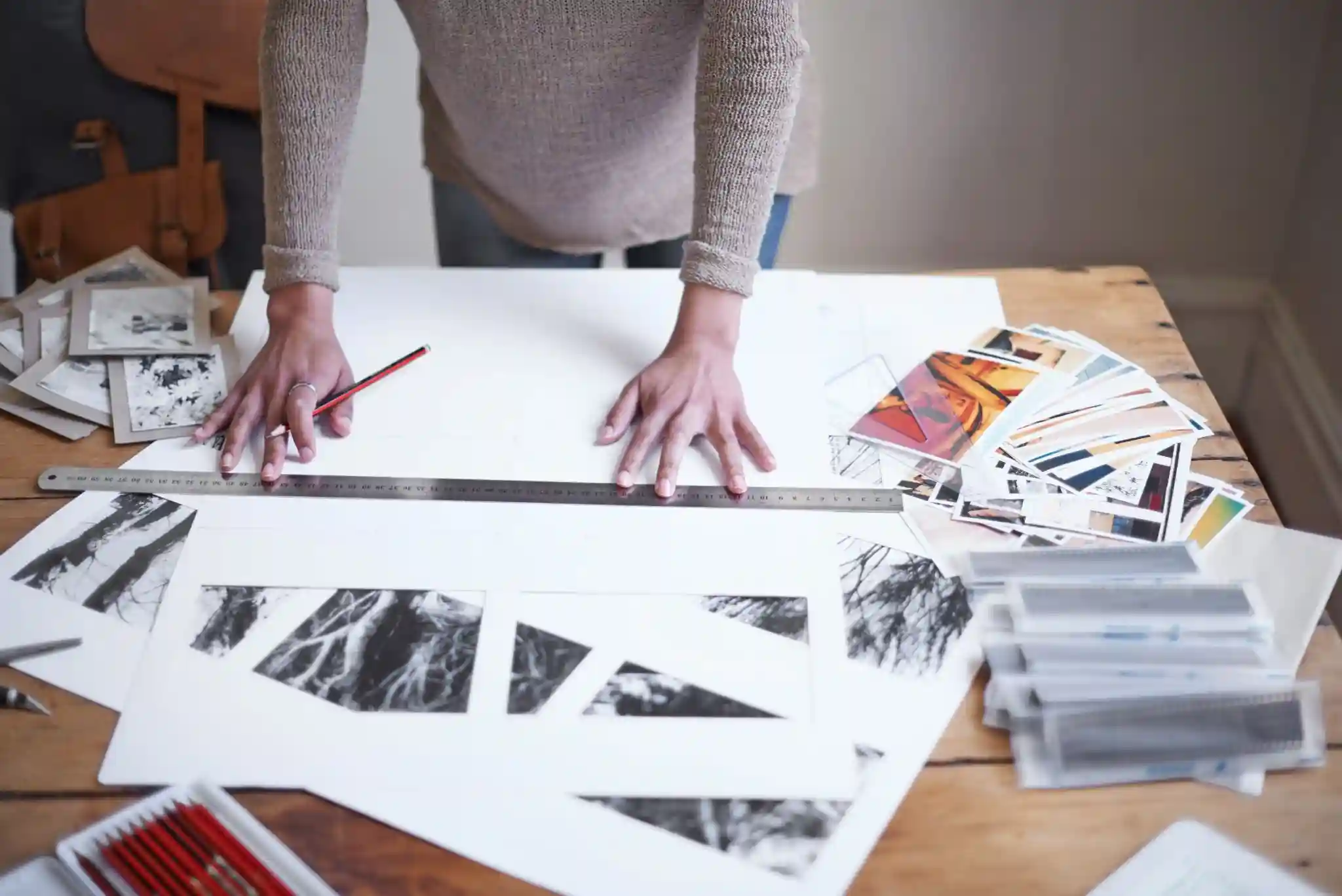
Traditional artwork, including paintings, drawings, watercolors and mixed media originals, can produce artwork for printing of extraordinary quality when the digitization process that converts the physical original into a digital file is approached with the same technical care that digital artwork creation requires. The two primary digitization methods available to traditional artists are flatbed scanning and professional photography and the choice between them depends on the size and the surface texture of the original artwork. Flatbed scanning produces the most color-accurate and the most detail-rich digital reproduction of flat artwork within the scanner’s size capacity, typically A3 or tabloid size for professional-grade art scanners, because the controlled and consistent lighting of the scanning process eliminates the reflection, shadow and perspective distortion that photography introduces.
Choosing the Right Print Format and Paper for Your Artwork
How Paper and Format Selection Complete the Print Quality Picture
The paper and format choices that determine how artwork for printing is physically realized are the final variables in the print quality equation and ones whose impact on the final experience of the print is as significant as the technical file preparation that precedes them. Fine art papers including cotton rag papers, bamboo papers and archival heavyweight papers provide the surface texture, the color accuracy and the archival longevity that artwork deserving of serious presentation requires. Giclée printing on fine art paper using pigment-based inks that are rated for archival permanence of one hundred years or more under normal display conditions is the print production standard that serious art prints demand and that distinguishes fine art prints from decorative reproductions. The weight of the paper, measured in grams per square meter, determines the physical presence and the handling quality of the finished print in ways that significantly affect how the work is perceived when held and displayed.
Conclusion
Creating artwork for printing is the discipline that connects the private world of artistic creation with the physical world where prints are framed, displayed, gifted and sold. The technical knowledge that this discipline requires is not a barrier to artistic expression. It is the foundation that ensures artistic expression arrives in the physical world with the quality and the accuracy that the creative work deserves. Understand resolution before you begin. Manage color throughout the process. Choose paper and format with the same care that you choose your medium. And the print that arrives will be the work you created, realized in physical form exactly as you intended it. That is what artwork for printing done right actually delivers.