There is a moment that every artist who ventures into abstraction encounters and never quite forgets. The blank canvas is in front of you. There is no subject to copy, no reference photograph to consult and no representational anchor to organize the composition around. There is only paint, color, the shapes you choose to make and the vast open question of how to make them mean something. This moment is simultaneously the most frightening and the most exhilarating experience available in visual art because it reveals immediately whether the artist has developed a genuine visual language or has been relying on the scaffolding of representation to organize their work without being fully aware of it. Abstract art is frequently misunderstood as the form of art that requires the least skill because it abandons the technical demands of realistic representation. The reality is precisely the opposite. Abstraction requires a deeper and more disciplined understanding of the fundamental elements of visual language, color, shape, line, texture, balance and movement, because when representation is removed those elements are no longer supporting a recognizable subject.
What Abstract Art Composition Actually Means Beyond Artistic Freedom
How Intentional Structure Creates the Emotional Coherence That Great Abstraction Demands
The most persistent misconception about abstract art composition is that it is the absence of composition rather than a different and more demanding application of compositional intelligence. Composition in representational art has the subject to organize around. The portrait has the face. The landscape has the horizon. The still life has the objects arranged on the table. These subjects provide the viewer with an immediate organizational anchor that tells them where to look first and how to navigate the rest of the picture plane. Abstract art composition must create this organizational intelligence entirely through the relationships between visual elements rather than through the presence of recognizable subject matter. This makes every compositional decision in abstract art simultaneously more consequential and more visible than in representational work because there is nothing to distract the viewer from the composition itself. The placement of a shape, the temperature of a color, the direction of a line and the texture of a surface are not supporting elements in an abstract composition.
The Language of Color in Abstract Art
Color Temperature, Contrast and the Emotional Architecture of a Painting
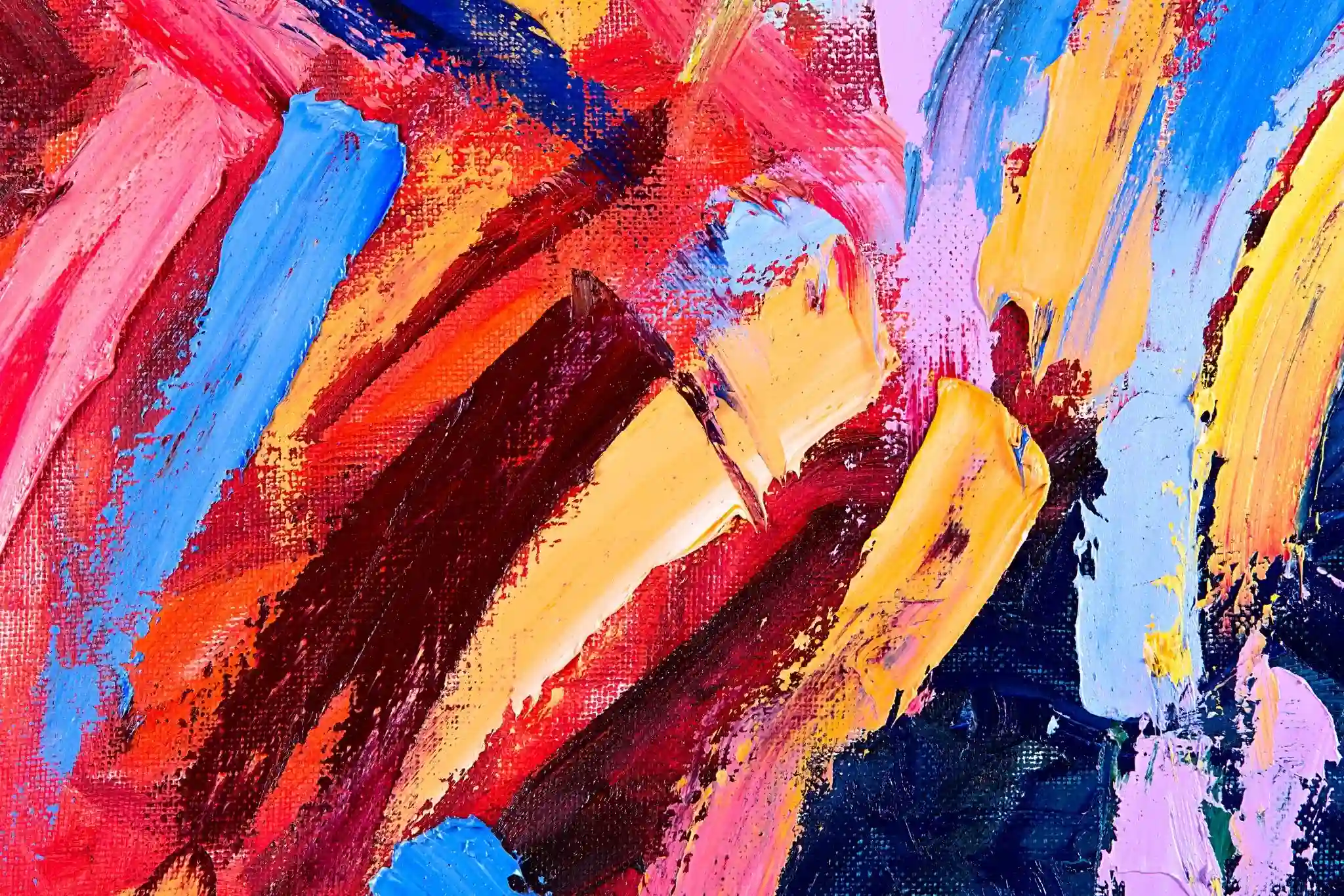
Color is the most immediate and the most emotionally powerful element available to the abstract artist because it communicates directly with the viewer’s nervous system before conscious analysis has had time to engage. Warm colors including reds, oranges and yellows advance visually, creating the sensation of proximity and urgency that makes them the natural choice for elements the artist wants to dominate the viewer’s attention. Cool colors including blues, greens and purples recede, creating depth and spatial recession that the artist uses to establish the layered dimensionality that prevents flat abstract compositions from feeling static. The contrast between warm and cool areas within a single abstract composition creates the visual tension and the spatial movement that pulls the viewer’s eye through the picture plane in the sequence the artist intends rather than allowing the gaze to settle indifferently anywhere.
Color Relationships and How Palette Decisions Create Visual Harmony or Tension
The palette decisions that an abstract artist makes before beginning a composition determine the entire emotional register within which the work will operate and define the range of visual experiences it can create. Analogous color palettes, which combine colors adjacent to each other on the color wheel including blues, blue-greens and greens, create the visual harmony and the unified atmospheric quality that gives certain abstract compositions their meditative, serene character. Complementary color combinations, pairing colors from opposite sides of the color wheel including orange with blue or red with green, create the maximum chromatic tension that produces the visual vibration and the energy that makes certain abstract compositions feel electrically alive.
How Shapes Communicate Without Words in Abstract Composition
Geometric Shapes and the Order They Bring to Abstract Space
The vocabulary of shapes available to the abstract artist divides most naturally into the geometric and the organic, and the choice between them, or the specific combination of both, is among the most consequential compositional decisions in any abstract work because shapes carry inherent emotional and psychological associations that operate below the threshold of conscious recognition. Geometric shapes including squares, rectangles, circles, triangles and the precise polygons derived from mathematical relationships carry associations of order, rationality, structure and human intention that make them the natural expressive language of abstract art concerned with themes of architecture, system, logic and the constructed world. The right angle of a rectangle creates the sensation of stability and groundedness that the human visual system associates with constructed environments and human-made order.
Organic Shapes and the Emotional Energy of Fluid Form
Organic shapes, those derived from observation of natural forms rather than geometric calculation, carry the opposite emotional associations from their geometric counterparts and create fundamentally different experiential qualities in abstract compositions that use them as their primary formal language. The biomorphic curves that appear in the abstract paintings of Joan Miró, the flowing forms of Jean Arp’s sculptures and the landscape-derived abstractions of Georgia O’Keeffe all demonstrate how organic shapes create the sensation of life, growth, breath and the natural world’s inherent tendency toward asymmetrical completeness rather than geometric perfection. Organic shapes feel found rather than constructed, discovered rather than designed, and this quality of apparent naturalness gives abstract compositions built from organic forms an immediacy and a sensory richness that geometric abstraction achieves through different means.
Balance, Movement and Visual Weight in Abstract Compositions
How Visual Weight Distribution Determines Whether a Composition Lives or Dies
Balance in abstract art composition is the most misunderstood compositional principle because it is consistently confused with symmetry, which is only one of its possible expressions and far from the most interesting one. Symmetrical balance, in which elements on either side of a central axis are identical or near-identical in visual weight, creates the formal stability and the ceremonial quality that makes it appropriate for specific expressive intentions but that produces a static, closed quality when applied without awareness of its limitations. Asymmetrical balance, in which visual weight is distributed unevenly across the composition while maintaining an overall equilibrium, creates the dynamic tension and the implied movement that give the most vital abstract compositions their energetic quality. Visual weight is determined not just by the size of elements but by their color intensity, their value contrast with surrounding areas, their textural density and their position within the picture plane.
Line, Texture and the Tactile Dimension of Abstract Art
How Line Quality and Surface Texture Add the Dimension That Color and Shape Cannot
Line in abstract art composition operates simultaneously as a shape-creating element, a directional force and an expressive mark whose character reveals the physical and emotional state of the artist at the moment of its creation with a directness that no other visual element can match. A thin, precisely controlled line created with a fine brush and carefully mixed paint communicates a fundamentally different emotional content from a broad, gestural line applied with a palette knife or a brush loaded with fluid paint in a single sweeping motion, even when both lines occupy identical positions in an identical composition and define equivalent shapes. The quality of the mark is the content. Texture in abstract art adds the tactile dimension that extends the viewing experience beyond the purely visual into the haptic, creating the sensation of surface that the viewer’s eye reads as information about the physical process of the painting’s creation.
Conclusion
Abstract art composition is the practice of speaking a language that bypasses the rational mind and communicates directly with the emotional and perceptual intelligence that color, shape, line and texture activate in every human viewer. The colors you choose carry emotional content that precedes analysis. The shapes you place communicate personality and energy before the viewer has formed a conscious thought about them. The balance you create or deliberately disrupt determines whether the composition feels resolved or restless, inviting or challenging, serene or urgent. None of this happens by accident in the work of artists who have developed genuine abstract art composition skills. It happens through the accumulated understanding of how these visual elements work, individually and in relationship, to create the specific experience the artist intends. Develop that understanding. Trust what you discover through practice. And make work that is genuinely yours.